


Overview
LinenFinder LeadFlow manages the sales pipeline by displaying opportunities as they move through defined stages, from origination to sale (Won) or archival (Lost).
After the pipeline is organized, use the search options and reports available on the Pipeline Analysis page to review pipeline data.
Tip: Click the images to enlarge the details.
Steps
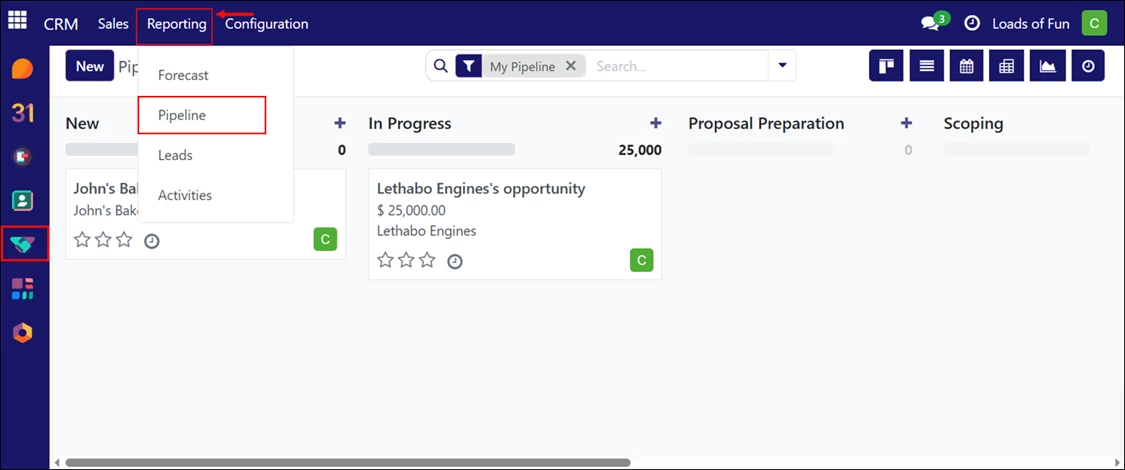
Log in to your LinenFinder LeadFlow account and open the CRM screen from the left-side navigation menu.
This screen displays all sales opportunities organized by pipeline stage. By default, it shows the current user’s pipeline.
From the top navigation menu, click “Reporting,” then select “Pipeline” from the dropdown menu.
Pipeline Analysis Page Overview
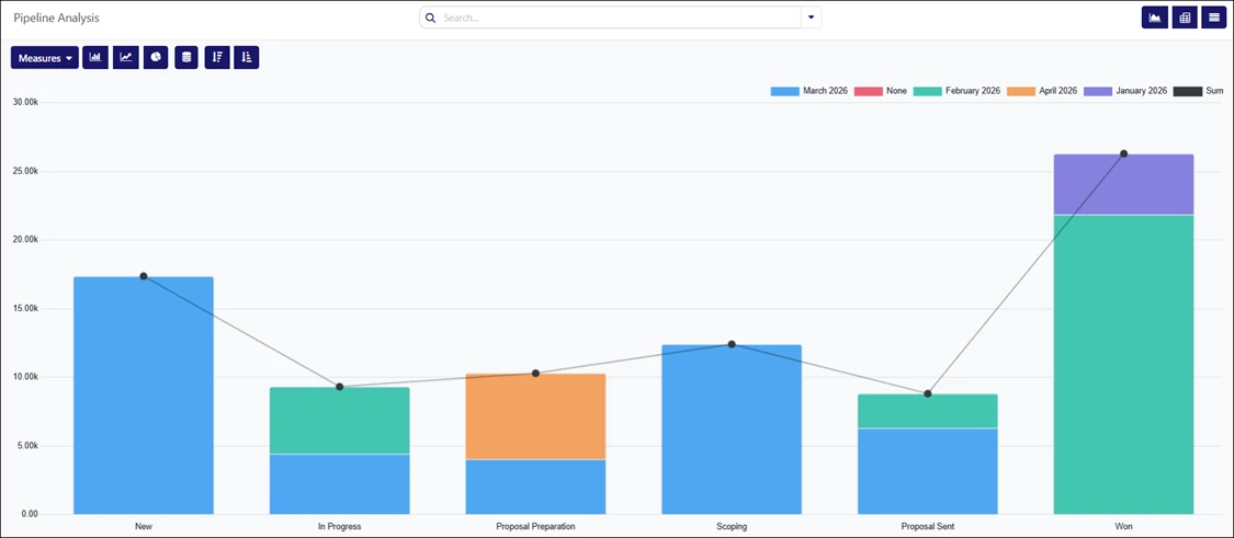
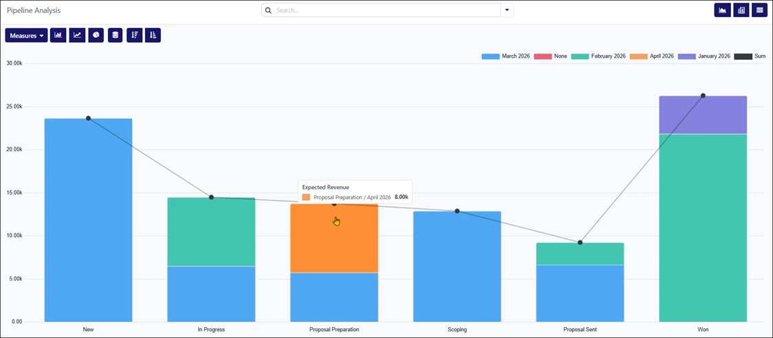
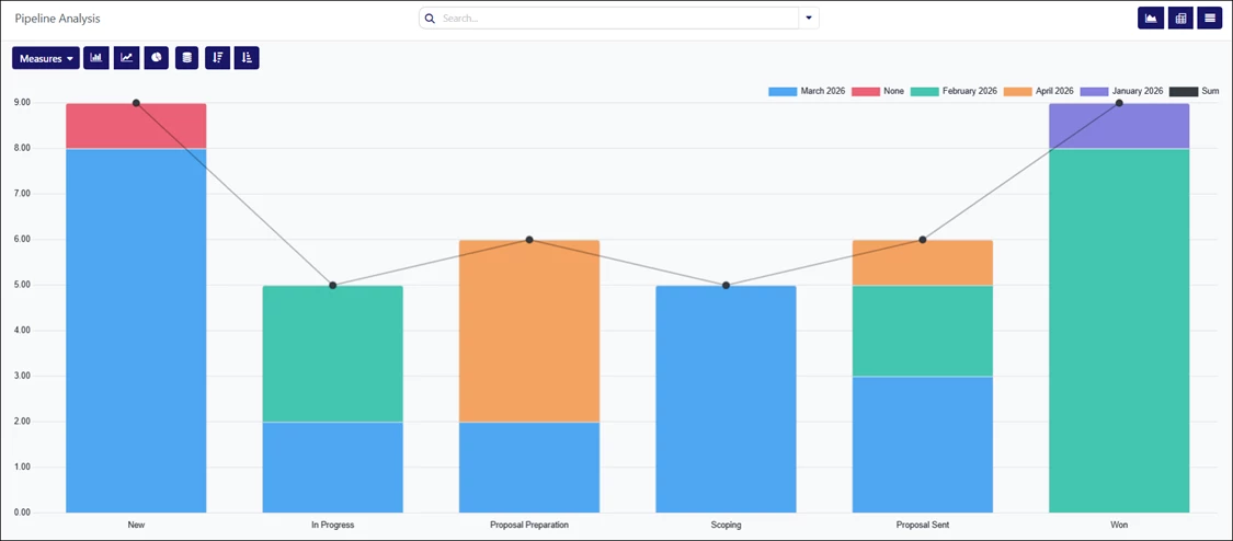
When the Pipeline Analysis page opens, a bar graph automatically loads, showing prorated revenue from opportunities over the past year. Each bar represents a pipeline stage, and the color indicates the month the opportunity reached that stage.
This initial view provides a high-level snapshot of pipeline activity without requiring any filters or adjustments.
The legend contains the month names/years. You can click each one to remove it from the graph you are viewing.
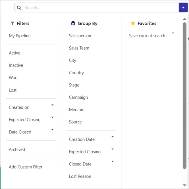
Search and Filter Options
The Pipeline Analysis page includes search and filtering tools that let you refine the data displayed.
To add new search criteria, open the dropdown icon next to the Search bar and select the search options to apply to the report.
Filters can be combined to narrow results based on specific attributes, such as stage, owner, or date-related values.
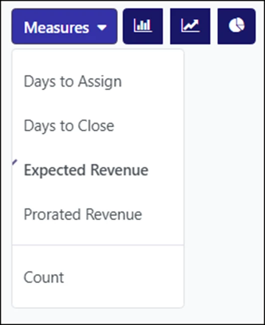
Measure Options
The Measures tab on the left side of the screen controls how data is calculated and displayed in the report.
This feature is only available when using the Graph and Pivot view. Available measures include:
- Days to Assign – Shows the number of days between when the opportunity was created and assigned.
- Days to Close – Shows the number of days between when the opportunity was created and closed (Won).
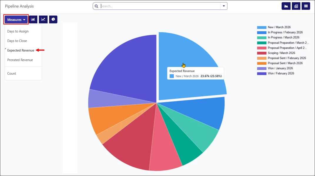
- Expected Revenue – Displays the expected revenue value for opportunities.
- Prorated Revenue – Displays revenue distributed over time.
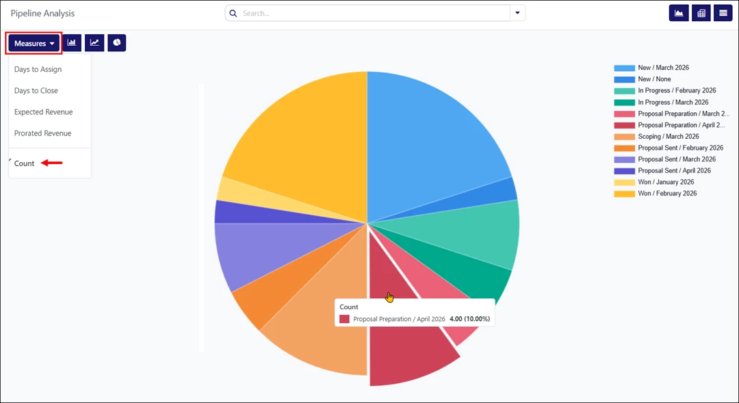
- Count – Displays the total number of opportunities that match the selected criteria.
View Options
In the upper-right corner, there are options that allow you to switch between different report views:
- Graph view – Displays the data in a bar graph. This is the default view.
- Pivot view – Displays results in a categorized metrics table that can be customized.
- List view – Shows the report as a list of individual records.
Each view presents the same underlying data in a different format.

Using Graph View
The Graph view displays the selected data as one of the following chart types:
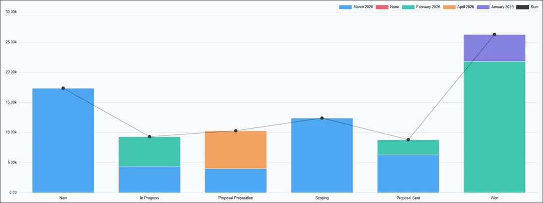
- Bar Chart – Displays the report in a bar chart format, divided by pipeline stages and filtered by expected closing month. Clicking each bar opens a detailed list of opportunities for the selected category. This is the default view.

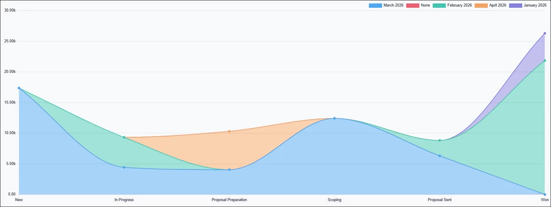
- Line Chart – Displays the report using a line chart format. Hover over each pipeline stage to view more details.

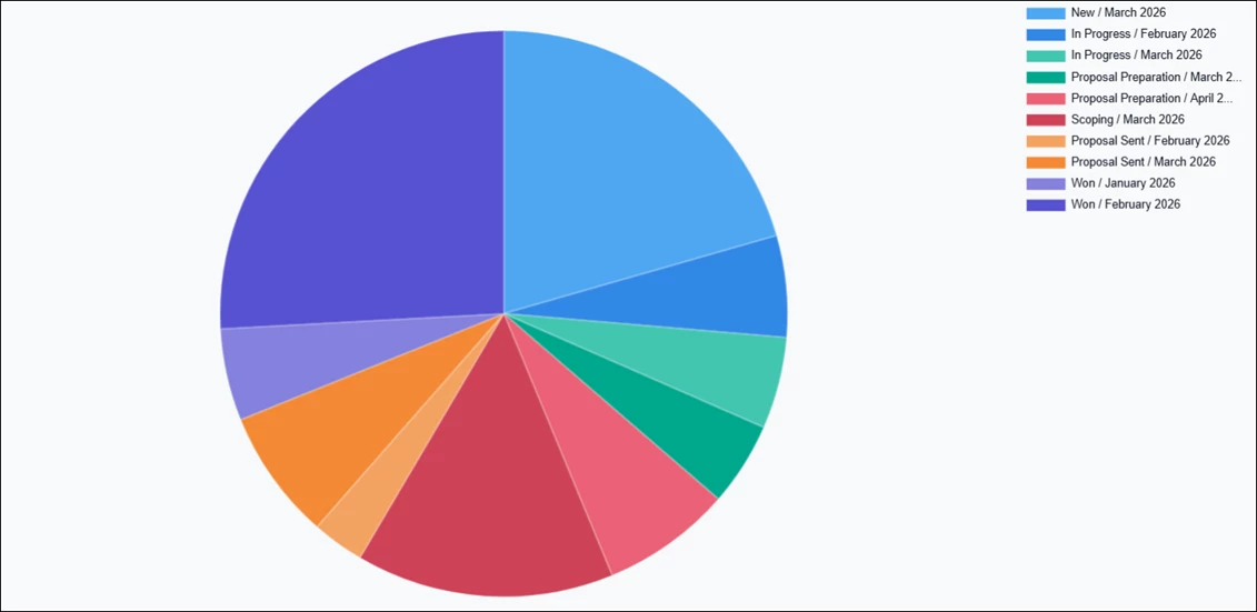
- Pie Chart – Used to display how values are distributed across stages. Clicking each slice opens a detailed list of opportunities for the selected category.

Additional options may be available depending on the selected chart type and grouping:
- Stacked – Displays grouped values stacked on top of each other (bar and line charts only).
- Cumulative – Displays running totals over time (line charts only).
- Ascending / Descending – Reorders stages from left to right based on value.
These options adjust how the data is displayed without changing the underlying search criteria.

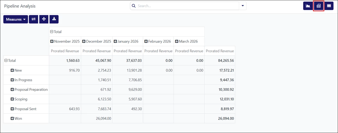
Using Pivot View
The Pivot view displays the analysis results as a table. This view shows more detailed numeric data than the graph view and supports exporting results for use in spreadsheet applications.
The icons in the top-left corner of the page perform the following functions:
- Flip Axis – Switches the X and Y axes for the table.
- Expand All – Expands all grouped rows when additional groupings are selected using the ‘+’ (plus sign) icons.
- Download xlsx – Downloads the table as an Excel file.
By default, this table view groups the results by sales pipeline stage and measures Prorated Revenue.
You can adjust the results by selecting the “Total” field and using the “Measures” button to display different values.
Using List View
The List view displays a single list of all opportunities in the system. You may filter the results in this view using the Search bar. You can click each opportunity for closer review.
Clicking “New” in the top-left corner closes the list view and opens the New Opportunity page.
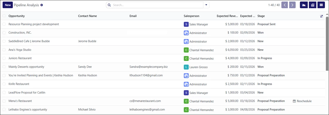
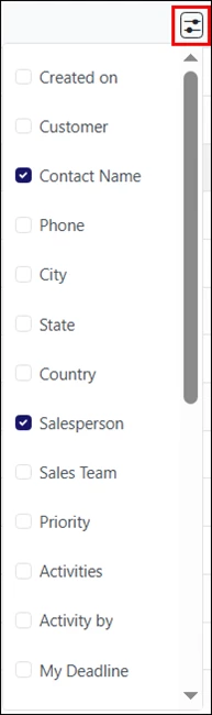
Additional columns, such as Customer, City, Phone, etc., can be added by clicking the Filters icon in the top-right corner of the list.
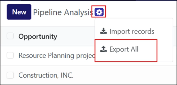
To export the results to an Excel sheet, click the gear icon on the top-left corner, then select “Export All.”
Example Screenshots
The following screenshots show the Pipeline Analysis in graph view, using two formats: bar and pie charts.
Bar Chart
“Expected Revenue” Filter Applied to Bar Chart – Hovering Over April 2026:
When hovering over a specific bar, you will see the opportunity’s pipeline stage, expected closing month, and total expected revenue. You may click the bar to view each filtered opportunity.
“Count” Filter Applied to Bar Chart:
Pie Chart
“Expected Revenue” Filter Applied to Pie Chart – Hovering Over “New” Opportunities:
Hovering over each slice displays the opportunity’s pipeline stage, expected closing month, and total expected revenue. You may click the slice to view each filtered opportunity.
“Count” Filter Applied to Pie Chart:
Video Resource
Follow along the video below for more information on using the Pipeline Analysis report in LinenFinder LeadFlow. Instructions begin at the 2:15 minute mark.